Theater Logo
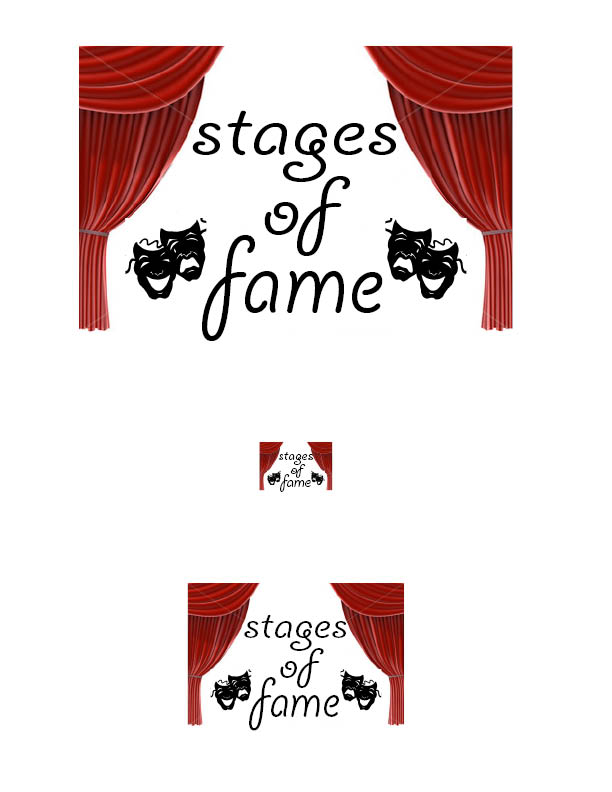
To start this design off I tried to think of images that instantly reminded me of theater, but at the same time corresponded with the company's name. I finally came to the conclusion of stage curtains. This created the perfect framing for the name of the company in the logo. I made the font an "artsy" almost cursive writing keeping the theater image. I centered the three words in levels which again harkens back to the first word in the company's name "stages". TO fill the void space around the words i chose to put in images of the classic theater masks to create a common image in the viewer's eyes as well as bring back the theater "scene".